BEES innovative
e-commerce

UI Design | Research | Vision - MVP | Strategy
Context
BEES is the 10th largest
e-commerce in the world. GROW is the call center that provides personalized tasks for agents to proactively contact customers via phone or chat to close sales gaps and educate about benefits.
Business goal
Optimize agent's time by increasing productivity and effectiveness.
Solution
Redesign GROW to a more robust and user-centric platform allowing our users to easily search and find content during any part of the call.
My role
Worked with PM and Researcher to create an innovative interface to drive the future of GROW.
It all started with workshop in Mexico...
Towards the end of 2022 and I was helping our Researcher to build a business workshop in Mexico for the next week when our Design Lead decided that we could take advantage of it and gather more insights while they were insite.
After the workshop, while the business team were deciding what to attack in 2023, we organized all the data (CSD Matrix, Surveys, Data insights, etc) to have a clear vision of our scope, problems and opportunities.
Long term impact and building the next big thing..
Before and After
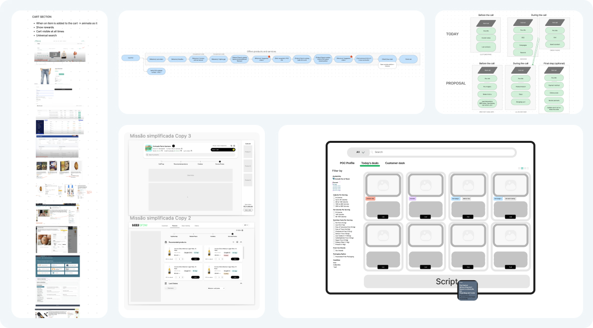
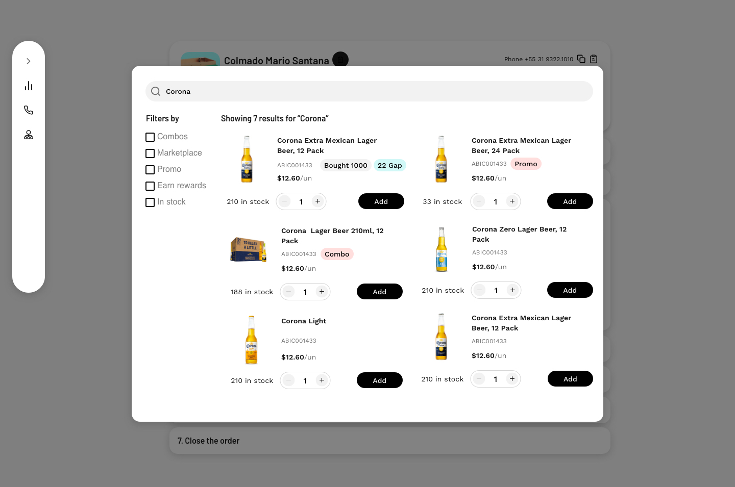
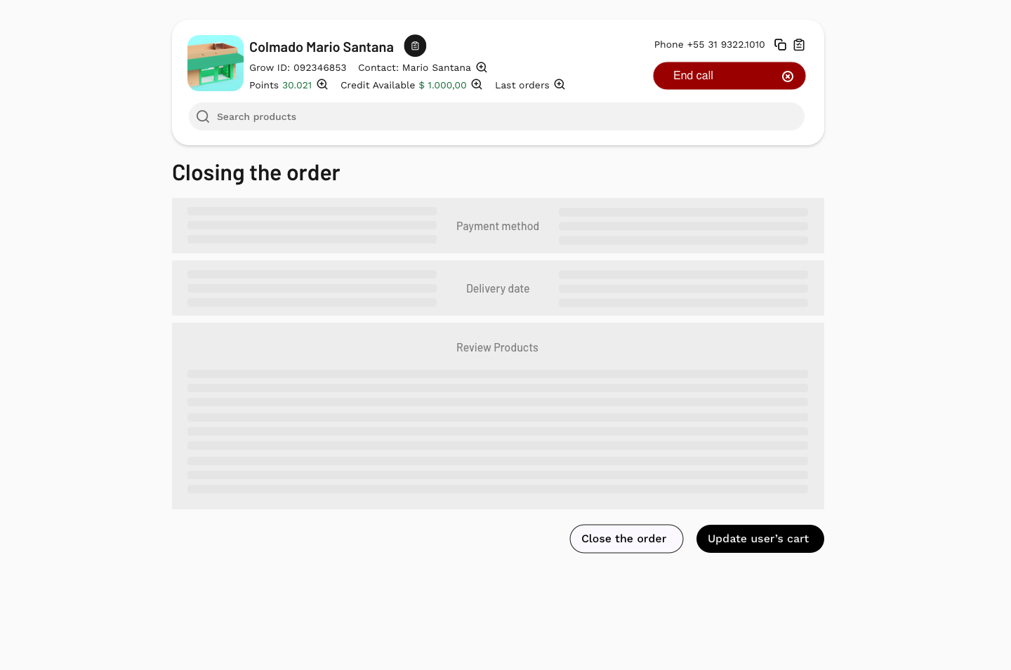
With all of that research, my Design Lead gave us a week to build a future interface (which he called a 3-year vision), encouraging us to think bigger and consider opportunities that had not previously been explored.

This approach gave us a safe space to share our creative ideas while getting visibility from stakeholders, without the pressure and judgment of “having” to build it.

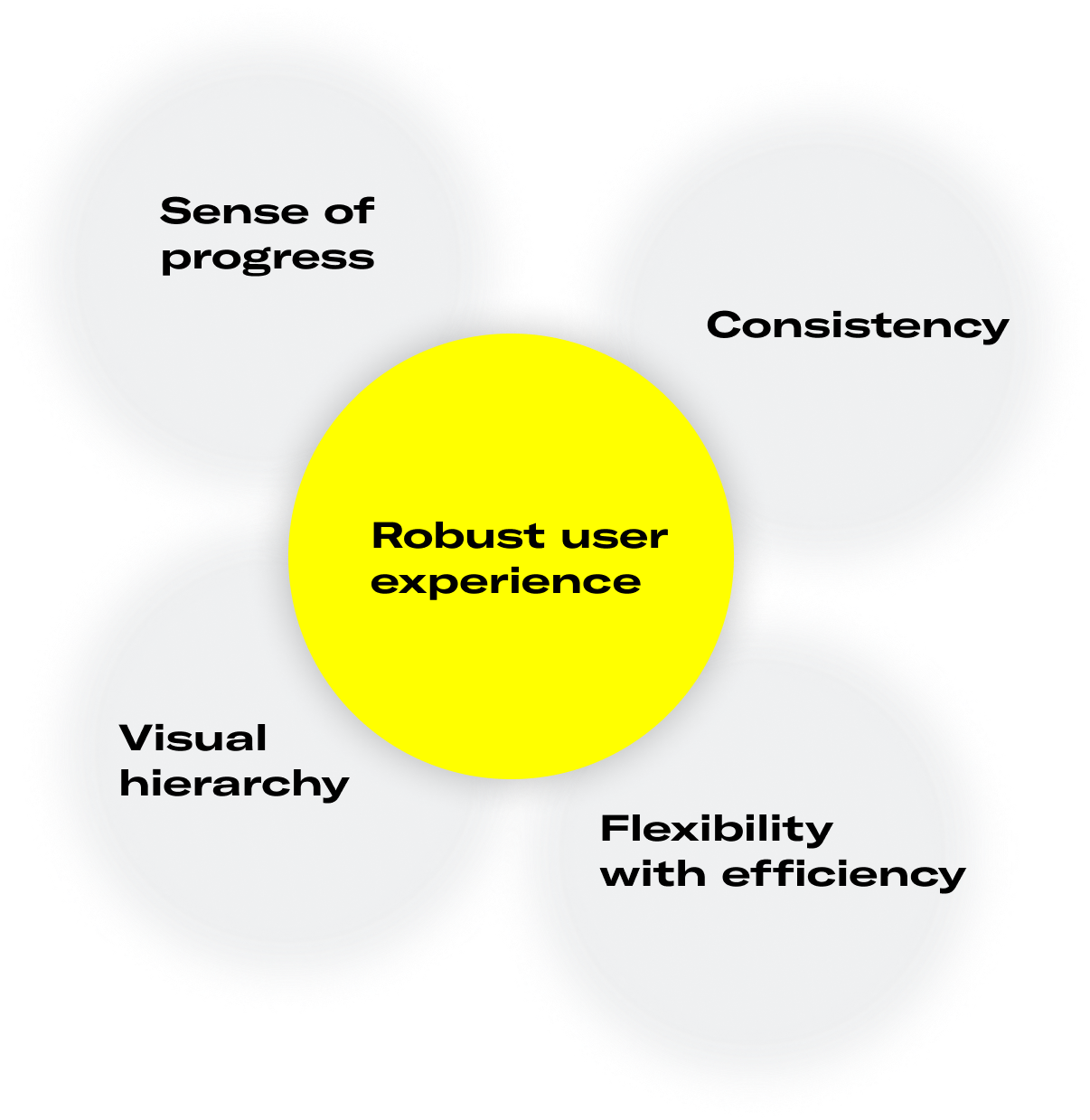
At the end of the day, we’re not only selling products to customers externally, but also selling our ideas to teams and stakeholders internally, and the key to any successful sale is communication.
We found our main problems
Limited time
- 83 calls per day on average
Complex interface
- They spend too much time to find a product. In most calls, users go to the Cart page to use the search. Occasionally they look for the same product in other parts of the platform.
Non-optimized classification process
-
Users waste a lot of time at the end of the call classifying their tasks.
- Common users' complaint.
5 different interfaces (UI) to present products
-
High cognitive load to scan information.
Overall conclusion
-
More time spent, less convertion,
and less bonus payment for our user.
Coming up with a solution
It was time to ideate, so to get inspired I started with some benchmarking, and took it from there with flow mapping, early sketches, wireframes, and on.
But how did we evaluate? (not validate folks)
Imagine if word gets out and everyone knows what exciting new features BEES is working on.

So just like Apple we decided to rely on Design heuristics and...
....on reviews/critiques with highly knowledgeable people,
usually design directors, VP of products, and managers.
You might think this is a biased way of making decisions, but I’ve found those sessions way more valuable than any user testing I’ve been in. The amount of detail that gets challenged is unbelievable and you can see that the brightest people are looking after the user experience so these products are easy and simple to use.
Interface solution
Transform our previous platform into a possible but outside of the box experience, having in mind that It could be integrated with our DTC applications (through Zé delivery 🇧🇷 and TaDa 🇲🇽🇵🇦🇨🇴🇪🇨🇩🇴🇵🇾🇦🇷🇵🇪).
New call prep experience
Entire client's history in one place with callouts and insights.
New mission experience with a integrated cart
(including a script speech)
Cart loading bar: Users are more likely to complete a task if they are provided with a visual sense of progress..
Mission outcome: Users have the flexibility to classify their tasks during the calls, saving time at the end.
Universal search: Users can find products at any phase of the call.
Hierarchy: Information displayed according to the user's mental model.
Optimized search experience
(including filters by categories)
Closing the cart
A specific page to review the order
Update user's cart feature: GROW aims to digitalize all clients.
- So users can sync their cart with the client's cart allowing the client to buy through their app. Which removes friction and boots conversion.
- It also educates the clients, giving them confidence to self-service in the future and earn benefits like Rewards.
Main results & learnings
- In January, we achieved an overall mission effectiveness rate of 24.2%, which represents a 0.9 p.p. increase compared to the previous month. This also marked the highest number of effective missions completed at 515k.
- The Topline Gap mission accounted for the highest number of hits, with a 36.4% share and an effectiveness rate of 29%. This mission had a significant impact, resulting in the recovery of $100 million USD in topline gap.
- The Marketplace mission had the highest effectiveness rate among all missions at 34%, which represents a 12.7% increase from Q4.
- 10% of NPS (Net Promoter Score) growth.
Learnings & Opportunities:
-
Having a clear vision of what the platform could look like in the future has enabled us to gain buy-in from our stakeholders, including VPs and executive leadership. As a result, we have been able to break it down into smaller versions as we expand to other countries.
- Beyond money, having such an impacting on the next experiences was very gratifying.
Values of: Jan/2023.
Next project ➦