Sigalei was a 5 years old startup located in São Paulo (Brazil) that gathers open data related to the Brazilian government actions (bills, laws, executive decrees, parliamentary speeches) in federal, state and city levels and displays them on a digital platform (SaaS-B2B) along with information-crossing and insights that help the Public Affairs teams in organizations identify opportunities and risks related to their businesses.
Sigalei
UX UI Designer Jr
Dec 2020 — Dec 2021
The problem: During the past 5 years Sigalei had many different designers that worked solo building the features. That led to many design inconsistencies, usability problems and cost on customer support, huge component library, and slow product deliveries.
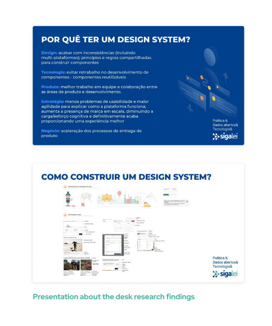
Approach: To educate the importance of building and evolving a design system through time, me (as junior) and my colleague (mid-level designer) did a presentation on how and why follow it.
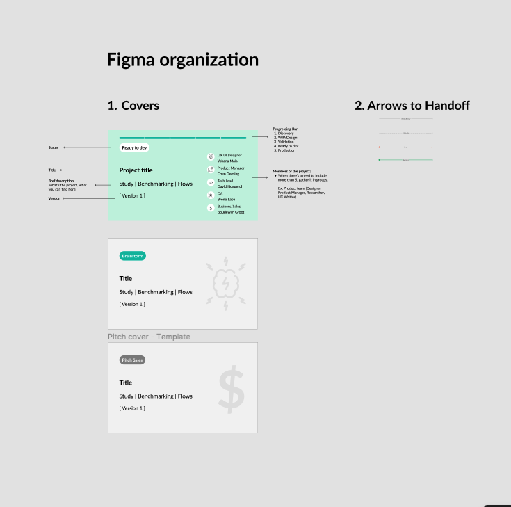
The process:
1. Design research on design systems.
2. Research results were presented to the whole startup in order to get everyone onboard the process.
3. Definition of OKRs for the design system, based on the company's and product team's OKRs for the semester.
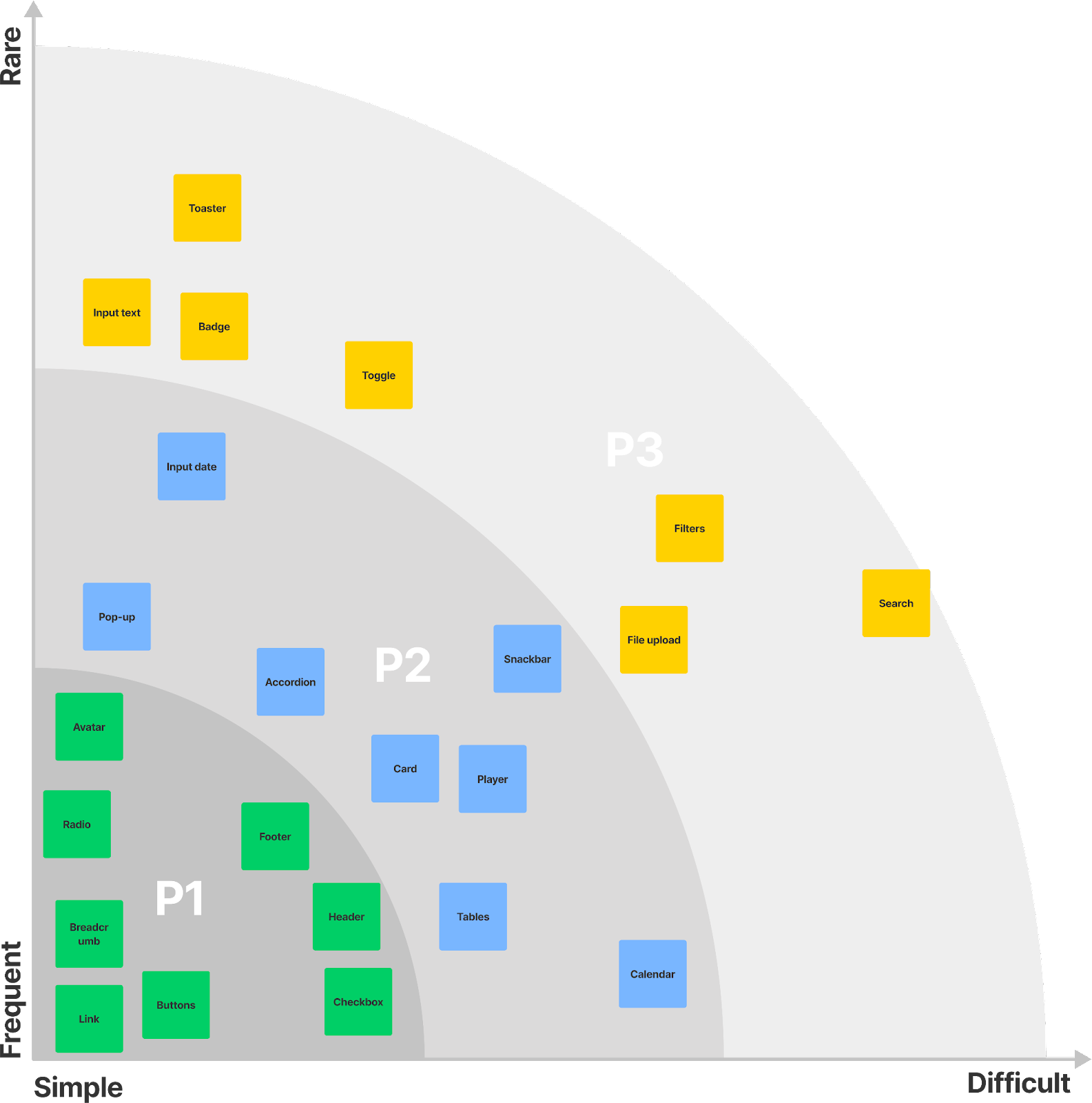
4. Mapping of the products interface and user flows.
5. Workshop with the whole team to establish Sigalei's principles.
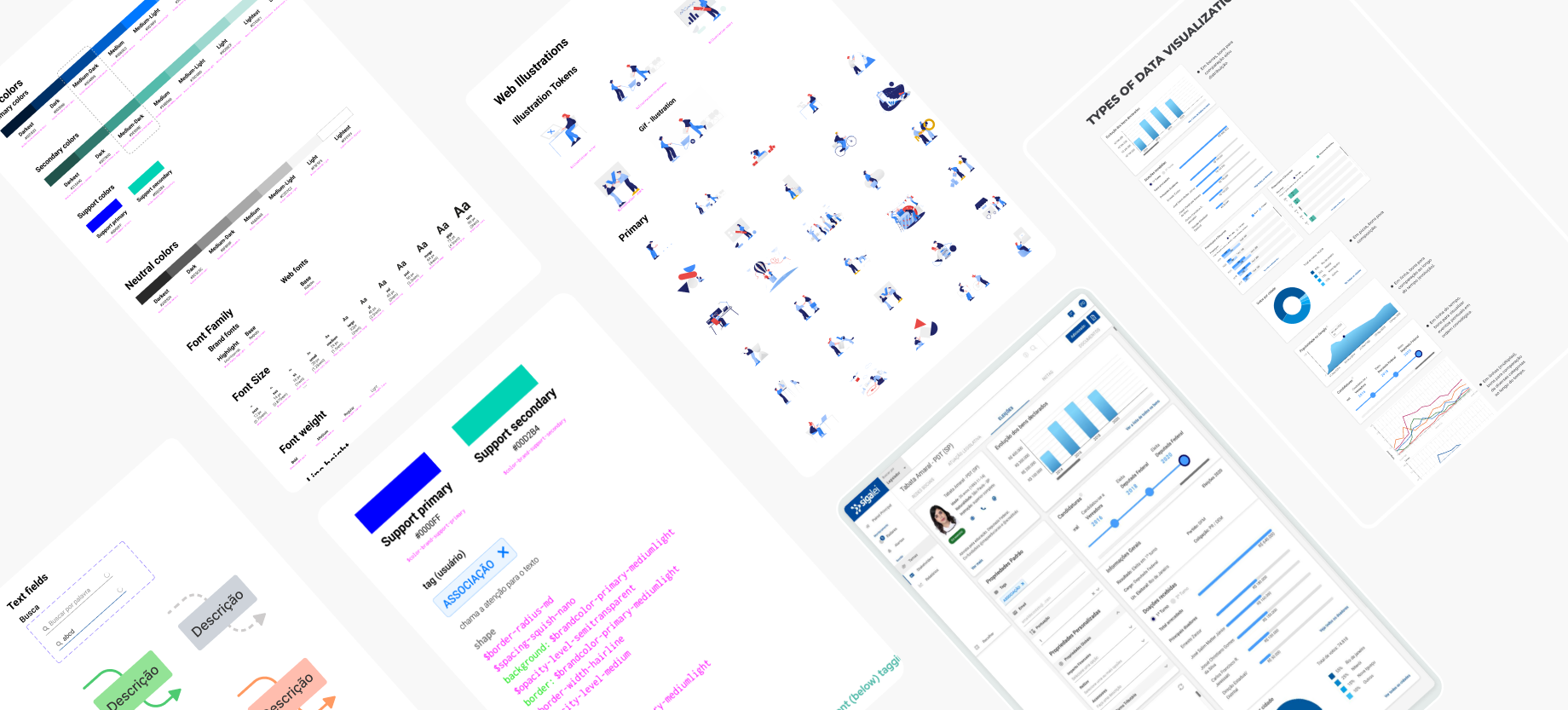
6. Design from smallest elements to create scalable rules.
7. Using new products releases to test and learn about new components.
The outcomes:
- High costumer approval on the interface changes and better user experience.
- Decrease in time spent helping users to navigate in new features.
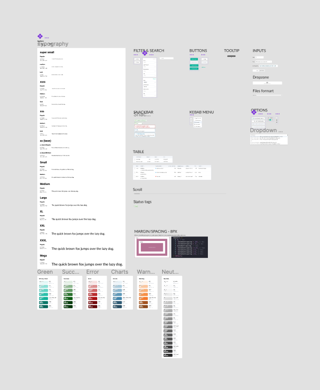
Since it was our first experience in establishing a design system, we based our new components on Material Design's guidelines.
Learnings:
- It's a continuous process and requires strategy, goals and key results, just like any other digital product.
- It requires the involvement of not only the design team, but also product, development, marketing, sales, management, and customer success.
.png)
%201.png)